Case
NFT Marketplace
A marketplace for digital art built around two audiences that need opposite things — artists who need an audience, collectors who need to be first.
Context and problem
A startup in digital art wanted a marketplace where artists could host and sell NFT collections. The founders arrived with two questions, and they pulled in opposite directions: how do we attract artists to the platform, and how do we tell collectors about a new drop fast enough that the price still matters.
Stakeholder interviews and a competitor review made the tension concrete. Artists judge a marketplace by how visible it makes them. Collectors judge it by speed — the research turned up a group whose whole strategy is to be early, and whose stated pain was the fee on failed transactions and missing a drop by minutes.
One platform, two audiences, and a navigation that had to serve both without becoming two products stitched together.
Constraints
- Nine weeks, discovery through hi-fi, alone: research, IA, wireframes, UI and the component library.
- No existing product — no analytics, no user base, nothing to test against except interviews and competitors.
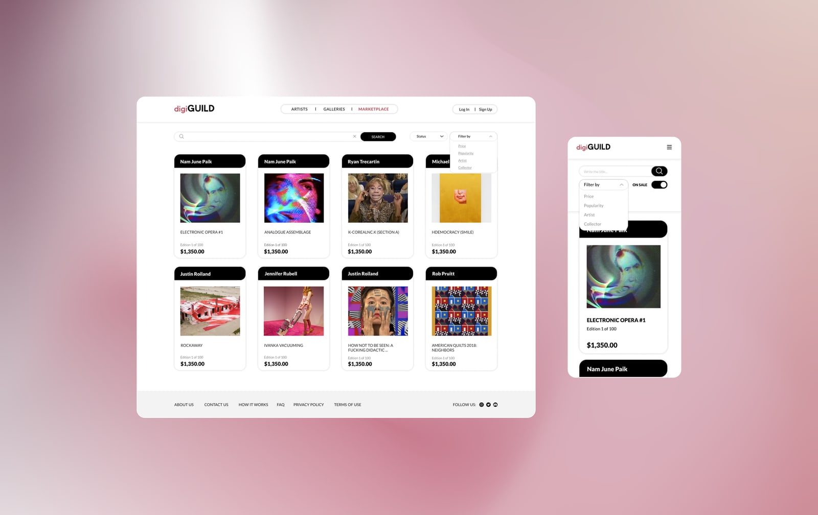
- Ten web pages and twelve-plus screens, each needing a mobile version, in a market where every competitor looked broadly the same.
- An audience fluent in crypto but impatient with interfaces — comfortable with wallets and gas fees, unwilling to spend attention learning a new layout.
- A fixed five-phase process — discover, define, ideate, design, test — planned across the nine weeks before any of it started. Balsamiq for wireframes, Figma for everything after.
Decisions
Navigation built around the drop, not the catalogue
Most marketplaces organise around browsing: categories, collections, filters. The research said the moment that matters is the drop, so status, upcoming releases and new drops became first-class navigation instead of a banner on the home page. A collector who opens the site should see what is about to happen before they see what already exists.
Galleries and artists as separate destinations
Artists needed visibility, not just a filter value. Splitting galleries and artists into their own sections — each with bios, collections and their own pages — gave the platform something to offer the supply side of the marketplace, which is the side that is hard to recruit. The obvious alternative, a single “browse” page with an artist filter, treats artists as metadata attached to art.
Mobile designed in parallel, not after
Every key screen was drawn in both widths at the same time rather than adapted afterwards. Drops happen at fixed times and people are rarely at a desk when one lands — a marketplace whose core moment is time-sensitive cannot treat the phone as a reduced version of the site.

The design system
Type, colour and grid
Lato in three weights — Black, Medium, Regular — across five sizes: 28, 22, 18, 16, 12.
A three-tint palette built on a deep plum, #6A3A4F, #C77A8C, #DAB6C2, split 70 / 20 / 10
so the darkest tint holds structure and the lightest is spent on accents. The palette was
chosen to sit under artwork rather than compete with it, since every screen is mostly other
people’s images.
A 12-column grid at 1440: 70px columns, 30px between them. Under it a 10px square grid, so every dimension in the file divides cleanly by ten.

Components
Buttons were drawn in two ranks and four states — primary and secondary, default, hover, pressed, disabled. Selects and search fields carry three, default, focused and disabled, because neither has a pressed state worth drawing. Links, tabs and the icon set complete the library.

Outcome

Ten web pages and more than twelve screens, desktop and mobile, delivered with a clickable prototype and a component library.
Six screens were wireframed in Balsamiq first — landing, sign up, log in, how it works, news and the artist list — then rebuilt in Figma as high fidelity. Five page types were carried through to hi-fi in both widths: home, marketplace, galleries, artists and the NFT page itself. The prototype went through a round of testing and feedback, and the changes that came out of it were built before the final presentation. It was scoped and delivered as an MVP.
What I’d do differently
I spent a large part of nine weeks on a detailed persona, and two of its lines did all the work — missing a drop by minutes, and the fee on a failed transaction. Next time I would run the research until it produced those two findings and stop there. The three-tint palette should have been tested against real artwork sooner: under a wall of saturated images it behaves differently than it does on an empty frame. And I assembled the components after drawing the screens rather than before, so states had to be filled in after the fact.