Case
Understudy
An interview practice tool that shows whether an answer got better, not what it scored.
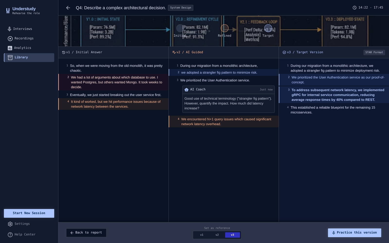 Built for a desktop screen
Context and problem
Designers moving into AI-native roles prepare for interviews alone. There is no counterpart pushing on the weak spots, and no one to judge whether an answer about eval pipelines, agent orchestration or RAG is technically sound. The tools that exist were built for a different kind of interview.
I broke down five of them — Mockin, Exponent, Final Round AI, MockInterviewAI, AceInterview. Each is strong in its own lane, and all of them stop at the same place: they score an answer and move on. None compares versions of the same answer, so the one thing a person practising actually wants to know — did this attempt beat the last one — is the thing no tool reports.
After practice, you can’t tell whether you got better.
Constraints
- One self-contained HTML file. The prototype had to open from a double-click, work offline, and survive being emailed. No build step, no libraries, no external requests.
- Nothing could depend on Figma. Image links exported from Figma expire in about a week. Anything pointing back at the design file would rot before the portfolio did.
- A day of design time, on top of a week spent building the agent pipeline that produced the research, the PRD and the screen specs.
- No brand inputs. There was no existing palette or type system to inherit — both had to be derived from the product’s tone and then held consistently across five screens.
Decisions
Version comparison is the core, not a feature
Every competitor ends the loop at a score. I gave version comparison the same priority as the interview itself and built the product around it: v1, v2 and v3 of one answer side by side, edits highlighted, the AI coach commenting in the margin — “dropped the hedging”, “added specifics on eval metrics”. A score tells you where you stand; it cannot tell you whether you moved. The obvious alternative — a number out of ten with a progress chart — measures sessions, not answers, and the answer is the unit people actually rehearse. The reference is deliberate: pull request review. This audience already reads diffs.
A persistent sidebar instead of a corridor
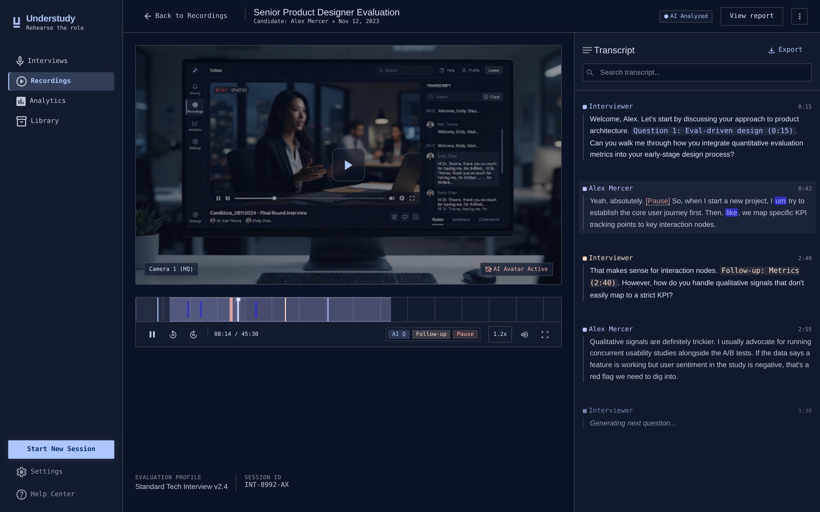
The first build moved in one direction only: you went forward through whatever button the current step offered, and getting back to the interview or an earlier report meant walking the whole path again. That is acceptable for a linear form and wrong for this product, because the value only appears on the second and third attempt — the whole point is coming back. I pulled navigation out into a persistent sidebar: interview, recording, report and comparison are one click from anywhere, and the current section is always marked. The product stopped being a corridor and became a workspace.
Five dimensions with evidence, not one number
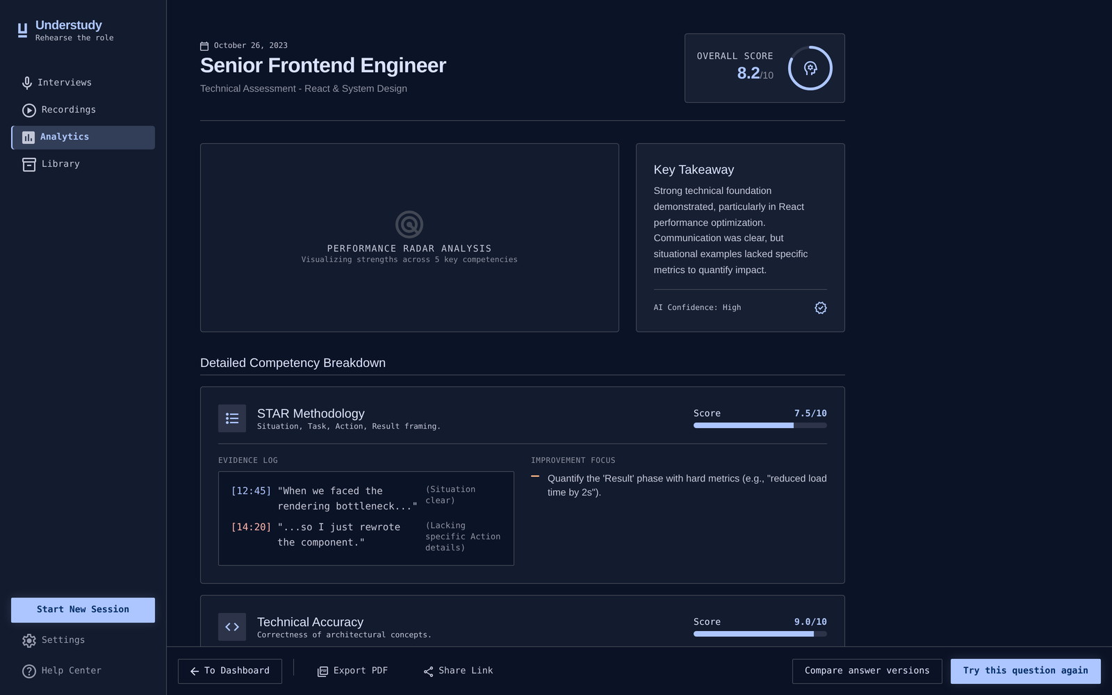
The feedback report scores five things — STAR coverage, technical accuracy, communication, specificity, role fit — and every score carries quotes from the transcript with timecodes. An overall number is easy to render and impossible to act on. A candidate who reads “7.5” learns nothing; a candidate who reads their own sentence at 14:20 with “lacking specific action details” beside it knows exactly what to rewrite. The cost is a longer, denser screen, which is why the report is built for scanning rather than reading top to bottom.
Outcome
A clickable prototype covering all five screens, live at a public URL and working offline from a single file.
I put it in front of five people and watched them move through it. Nobody needed help finding their way — the flow and the interface read the way they were meant to, and the visual language held across all five screens. The part everyone stopped on was the version comparison, which is the bet the whole product is built on.
That was a reaction round, not task-based usability testing. Five people are enough to tell you a flow isn’t broken and an idea lands, not enough to call a product validated. The next test is task-based, on the two screens that carry the value: the report and the comparison.
What I’d do differently
I would name the product once, at the start — it went through three working names before settling, and every artefact had to be corrected afterwards. I would write the palette and type scale into the pipeline’s inputs before generating anything, instead of letting them be inferred and then reconciled by hand across five screens. And I would run the first round with tasks rather than reactions: watching someone try to find their worst answer would have told me more than five people saying the flow was clear.
Try it yourself
The prototype at the top of this page is the real thing, not a recording.Open it full screen.