Case
SIMCEL
A digital twin for supply chain planning — four scenarios compared in one view instead of rebuilt by hand in spreadsheets.
Context and problem
SIMCEL is a planning tool for supply chain teams. Its users are experienced planners — people who know their domain deeply and have no appetite for learning new software.
Three things were broken. Planners compared scenarios by rebuilding spreadsheets by hand, which is slow and easy to get wrong. KPIs, P&L, campaigns and locations lived in separate tools, so nobody ever saw the whole picture at once. And every existing answer to this assumed a user willing to learn a new mental model.
The problem was not a missing feature. It was that a comparison — the core act of planning — had no place to happen.
Constraints
- Users who won’t be trained. Experienced planners, evaluating the tool against a spreadsheet they already trust. Any unfamiliar pattern is a reason to go back.
- Four scenarios at once, each carrying its own numbers through tables and charts — density was unavoidable, so it had to be made legible instead of reduced.
- Two months, discovery through developer handoff, with the component library shipping as part of the deliverable.
- A production product, not a concept: everything designed had to be buildable by the team that inherited it.
Decisions
Four scenarios, one table
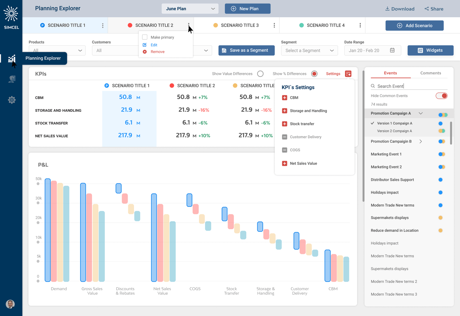
Each scenario keeps its colour from the tab through the table and into every chart. Deltas are calculated against the primary scenario, so the trade-off is visible without switching views. The obvious alternative — a scenario picker that swaps the view — is cheaper to build and destroys the comparison, because holding four sets of numbers in your head is exactly the work the tool was supposed to remove.

Where the money actually goes
The P&L waterfall breaks a scenario into its cost drivers, and hovering any step compares all four scenarios at that point in the chain. A total tells a planner which scenario wins; it does not tell them why. The waterfall makes the answer to “why” a hover instead of an export.

Events stay in context
Promotions, holidays and trade terms sit alongside the numbers they affect, in a panel that holds its place rather than opening over the work. Coloured dots show which scenarios each event belongs to. Putting events on a separate screen would have been simpler to build and would have broken the only reason to look at them — they explain the shape of the curve next to them.
Built for repeat use
Filter combinations save as segments and the KPI list is configurable, so a planner sets their view up once and returns to it. A new plan starts from an uploaded forecast or from an existing plan, so nobody builds from scratch. The dashboard is assembled from widgets and each user keeps their own layout. And in the detail table, dimensions are dragged into a stack — the order of the stack is the order of the grouping, so reshaping the table is a drag rather than a new report. This is a tool people open every week, not a report they read once — the second session should be faster than the first.

The design system
Five type sizes across seven roles, Roboto in three weights. Four scenario colours that carry meaning everywhere they appear, on a neutral scale consolidated from six near-identical greys found in the working file. Buttons, inputs, tables and modals were delivered as a component library that engineering built against and reviewed each build back to.
Dark UI on entry screens, light on the work surface — planners spend hours in the tables, and readability there outranks visual consistency across the whole product.

Outcome
Shipped and running in production. Ten web pages, more than eight chart types, and a component library handed to engineering with specs, reviewed against each build.
What I’d do differently
Lock the palette on day one — the file ended up with two blues, three reds and six near-identical greys, and consolidating them at the end meant touching every screen twice. Agree the dark-entry, light-workspace split with the team earlier: it was the right call for readability, but it surfaced late and had to be argued for after the screens were built. And settle the corner radius scale before building components — eight values were in use where three would have covered every case.